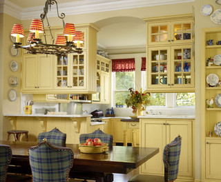
Showing posts with label Style Defined. Show all posts

Wednesday, October 14

Buying Guide: Kitchen Sink's


Since writing my Electronic Faucet Buying Guide, I have been asked to follow up with a Kitchen Sink Buying Guide to go along with it.  There are many kitchen sink option available in today's market.  Not only with size and design, but also materials of kitchen sinks.

I personally believe that the Faucet and Kitchen Sink are the two hardest working products in your entire home.  They need to be treated, and selected, as such.  Don't get a $99 sink/faucet set from Home Depot and then get mad when it's broken less than a year later.

When selecting a sink, your style of cooking and cleaning really need to be evaluated by you and your house hold.  Here are some things to consider:


  • Who does the dishes?  Don't get a sink too deep to cause back discomfort. Try them out.  
  • What's your dish washing style? Dishwashers use 1/6th the amount of water, and should be doing most if not all the washing.  Your dishwashing style will determine the number and configuration of bowls.
  • Is it for looks, or is it for function?  If you are an empty nester who eat out 5 times a week, your sink needs will be different than a family who always eats at home and has a house full of kids. 
  • What finishes are you looking for? Color, something that blends in with the counter?  The color you want will help determine the material.  
So, these are just a few questions to ask yourself.  When thinking about a kitchen sink, BE HONEST WITH YOURSELF. You are just doing yourself an injustice if you can't be honest about your needs and wants. Also, your needs need to come before your wants.  I shouldn't have to state this, but if your need is for something as indestructible as possible, but you want stainless to match your appliances, ditch the stainless, you will be disappointed. 

Now for the materials. I will say, I am a little biased and opinionated on the matter, but after selling sinks for 11 years, and hearing the complaints, my opinions are more about experience than anything.  
Franke Peak PKX11028 

Stainless Steel. Yes, they look good, but I hate them. I absolutely hate them.  To get a good stainless steel sink you should expect to pay around $750 and up. If you decide to go this route there are a few things you need to know.
  • They Scratch. No matter how much you spend, is going to scratch.  (Unless your my mom!) 
  • Get grids. If the sink doesn't include protective grids, buy them. They are generally $100 per grid. They will help protect the bottom of the sink. 
  • Gauge. First of all, gauge is the actual thickness of the steel, and the smaller the number the thicker the steel. I recommend getting a 16 or 18 gauge sink. 
  • How is it made? In addition to the gauge, this is the most important thing.  There are stamped sinks, where they take a giant sheet of steel and press them into the shape of the sink.  Think about that Salt Water Taffy. What happens when you stretch it?  It get's thinner. Some sinks are folded and soldered. These are the ones you want.  
  • The next is the noise.  Sound deadening pads and under coating will make the sink quieter when the disposal is on, and when the water is on. 
Rohl Shaws Original Casement Edge Sink

Fireclay. Fireclay sinks are popular with the apron front style sinks.  These super durable sinks are great. Beautiful, as well as durable.  They are just as durable as a Cast Iron sink, yet feature thinner walls, often allowing for a larger basin.  Like Stainless, you get what you pay for. Because of the nature of this material, every sink is different. Don't ever cut a cabinet or countertop based on a template. Only use the actual sink. 1/8th of an inch can ruin your kitchen!  Here are some questions:
  • Is it hand made or machine made?  Generally the price will tell you. If it's under $1000 assume its made by a machine. If it's hand made, it will be more costly.
  • Hand made typically have more of a chance of size variations. Meaning it could be up to 1/4"smaller or larger than the display. 
  • Ask about pooling, and do your research.  Some fireclay sinks have unlevel bottom's, which can result in liquids pooling in the bottom of the sink. Some people, myself included, could careless, but if this will bug you, make sure there aren't a lot of complaints online and through the showroom. 
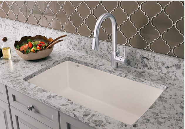
Blanco Diamond Super Single
Composite Granite. These are my own personal favorite. These sinks are a true work horse.  Scratch resistant, stain resistant, heat resistant, the whole deal. There are great shapes and designs available, and quite a few colors.  Most people opt for colors that blend in with their countertop, but contrasting the counter surface creates a great look as well. Like all sinks, you do get what you pay for. There are many brands of Composite Granite sinks, but in my opinion, Blanco's Silgranite is the one who has mastered the technology. 
  • First,when purchasing a composite granite (or any kitchen sink), be sure to inspect the sink for any cracks chips or damage before you even schedule your counter template. 
  • If you get a light color, I suggest getting a grid to protect the bottom of the sink.  Some pans, specifically cast iron, can transfer black marks.  They will come out, but why scrub if you don't have to. 
  • Some of the darker colors can also show water spots. If you have dark colors and hard water, simply dry out the sink after each use to avoid spots. It takes 2 seconds, it's easy, and good practice for any sink. 

Cast Iron. The traditional work horse. These sinks have been around for 50 years, and when taken care of, still look brand new.  Kohler is the major manufacturer of Cast Iron sinks.  There are many colors and shapes available. These sinks are cast iron, covered in an enamel.  They can chip, but the amount of force it takes to chip the enamel would ruin any sink on the market.  I typically warn people to be careful of the center divide if they get a double bowl. 
  • Like Composite Granite, if you get a lighter colored sink, get a grid to protect the bottom of the sink.  
  • Do Not Ever clean the sink with an abrasive cleaner like Ajax or Comet. It can scratch the glaze and you will never be able to keep the sink clean. (In fact, if you own some of these cleaners, throw them out for good!) 
  • Also, dark colors can get ruined by hard water, so be sure to wipe them dry when your done. 

So these are some of the major competitors for kitchen sinks.  Hopefully this gives you some criteria for a future sink and some ideas on what to look for when selecting your next sink.  Like a faucet, you get what you pay for, and you really need to invest in the best possible sink you can afford, which ever style you prefer.  


Monday, July 27

Trends 2015 : Kitchen

I woke up this morning thinking of the new trends in kitchens today.  There are so many beautiful and amazing products out there, and a mesh of styles that is harmony in design.  I decided to write this post.  Putting forward this mesh of Industrial Design with a Luxe Transitional feel.


So lets start talking about these products.  The new kitchen trends are leaning more toward these grey/beige/green tones, which is exactly what Benjamin Moore's Antique Jade is.  Want less green?  Then look no further than Halo, a perfect mix of grey and beige.  These soft colors are a great way to add warmth, and also brighten up a space.

For this kitchen mood board, I decided to take the Crystal Cabinetry Downing Way Raised Panel cabinet door, painted with Benjamin Moore's Halo. This is a great "Transitional" styled door, featuring clean lines, a slab drawer front, and a simple raised center panel.  Current cabinet trends include off white cabinets that ditch the glaze.  A crisp and clean look that isn't so stark and institutional.    The flat slab drawer head allows for an easier to clean design, which many home owners are looking for.  It also lends itself to a more decorative cabinet pull, which will add interest to the space.

For cabinet hardware, I am loving the Charlie Collection by Alno Inc.  The coloring I have chosen is Polished Nickel.  This color add's that little bit of Luxe to the space.  Chrome is too cold.  Polished Nickel is rich, luxurious, and warmer than chrome.  A major player in plumbing fixtures and hardware these days.  This specific cup pull is absolutely gorgeous.  It's simple design with just a little frill at the edges.

The knob is not too shabby either.  They have back plates for these knobs as well, for the more traditional installation.  These knobs, again, super simple, with just a little bit of detail on the edge.

This collection is available in many finishes, so even if you don't love Polished Nickel as much as me, you will still be able to find a color that you do love.  Some of the finishes include Brushed Nickel and Rubbed Bronze, which are two of the most common kitchen hardware finishes today.

For the faucet and sink, I have chosen a more Industrial looking faucet, with the beauty and traditional styling of a bridge faucet.  The Artesso faucet by Brizo. This faucet, also available in Polished Nickel and other popular fixture finishes, is an industrial take on a traditional style.  It features a side pull out spray, and a beautiful bridge design.  The Artesso family also features a standard Pull Down faucet with or without SmartTouch Technology, a prep/bar size faucet, and a matching soap dispenser.  Brizo has also launched a brand new style of faucet in this family.  Their Articulating Artesso Faucet, which is a unique and fully adjustable faucet.  I am still waiting to see what consumers think about this faucet.  I like the idea and the design, but not sure how it will work out in the real world.

When this faucet is paired with the Rohl Fireclay Apron Sink, you have the link between classic designs and modern industrial styles.  It is blended perfectly and looks absolutely stunning.

Tiling this design element is the best part.  Since everything is so simple, I wanted to bring in that intricate design through the hard surfaces, like a tile splash and the tile flooring.    The Walker Zanger Sterling Row Chesterfield in Linen Mosaic Tile is a heavy use tile suitable for flooring installation including heavy traffic and exterior surfaces, so it is a perfect material for the back splash in this kitchen, but can double as a splash and flooring tile.

I love the laser cut design, which creates that luxurious look bringing in textures and patterns.  The darker tiles in this design feature a wood look which brings in more warmth and supplements the missing texture from the painted cabinets.

Finally, this industrial styled light by Moda Lighting adds a second metal finish.  The Edison style bulb also adds to that industrial style, tying back to the faucet.  Many designers don't like mixing metal finishes, but like jewelry, mixing metal finishes in a room has become a new trend, and I hope this trend never goes away.

The many styles in this room, luxe, transitional, industrial, traditional, contemporary.  There is not specific style, but it all blends together seamlessly creating the kitchen that is today.  It is a mix on a classic, and hopefully will be around a long time.  Luxurious and timeless elements mixed with industrial elements.  I love it, and love creating it in people's homes.


Friday, September 26

Metallic Leather


Custom Brushed Metallic Beaver Meadow Brown Leather
on Chairs at the Langham Hotel in Atlanta, GA
Designed by Johnson Studio
Metallic's are a lot of fun, and a great way to bring in some extra texture into any space.  Sometimes they can be a little scary, and easy to overdo, but still fun.  I was surfing Pinterest not too long ago, and found some products that I have since fallen in love with.  The company in question is Townsend Leather, and their product line is absolutely stunning.  They specialize in all kinds of leather, but have a great collection of metallic finished leathers for interior design and fashion.  Their collection of embossed leather features several different metallic and foil finishes, that lets just say, I was rather excited to order some samples.  

Color: Silver
Pattern: La Scala Damask
Number: L-RD-1875-LAS
The first piece that caught my eye was the Razzle Dazzle Cowhide in La Scala Damask Silver.  I could see this textured and shiny leather featured on throw pillows, or even an upholstered headboard!  This particular design is not recommended for heavy use areas like seating, but great for accents or vertical applications, as the metallic foil can wear. 

The physical sample is just as beautiful as the photo, and the textured detail is absolutely stunning.  No trick photography here, it looks great, even at a distance.  I often worry about some of these textured materials because when entering a room they can often take two or three glances to actually get what's going on, but not this one.  


Color: Silver
Pattern: Ostrich
Number: L-EFAB-1875-LAS
One of the other leathers that instantly caught my eye was the Fab Foils Embossed Silver Ostrich on Cowhide.  This highly metallic leather sample took my breath away right out of the envelope. It almost looks like a piece of foil, so shiny and bright.  I already have a few projects I could use this for.  Like the Razzle Dazzle Cowhide, this color is not recommended for heavy use areas like seating, but great for accents or vertical applications.

I could see this more in fashion, like on a purse, or shoes, not so much furniture, however I could also see it utilized in some holiday decor, such as combined with blue and silver themed Christmas decor, as accent and accessories. 

Brushed Metallic Cowhide
Old Penny BM-8357
Looking for something that can be used in upholstery?  This chair is a great example of why I am now loving metallic leathers.  This chair is done in the Brushed Metallic Cowhide in the color Old Penny.  It has that subtle sheen that you would expect on say, and old penny, and it is sure to be an eye catcher when walking into a room.  I love it!  I really want a giant overstuffed leather chair in this color, in the corner of my bedroom to curl up with the Kindle, or write a blog post or two.  

This particular leather is Hand Rubbed to accentuate the metallic finish and the leathers own natural characteristics to create that patina that looks like the chair is your favorite.  

Townsend Leather also has some interesting textured metallics that can be used in upholstery.  The Aniline Gaufrage Cowhide pictured below is a breathtakingly luxe leather that looks fantastic on these chairs.  This photo below is the reason I wanted to write this post.  I love this transitional luxe vignette is exactly the kind of room I love creating, and can't wait to partner with Townsend Leather in creating these unique pieces.   Want more?  Check out the rest of my blog.  You can also find Townsend Leather on Pinterest


Wednesday, September 24

Fall Tablescapes and How to Create Them


Thanksgiving is just around the corner, so what could possibly be a better post, than setting that amazing feast table?

So, let me tell you a little about me, and my family when it comes to holiday feasts, we are the poster child for lazy meals.  We load up the island and treat it like a big buffet, if you want to eat, get off your butt and grab a plate.  There is nothing on the table, because the more you put there the more you gotta clean up.  You will only find the things that are required, a glass for your one beverage of choice, napkin, and a fork.  I wouldn't know the proper way to set a table if it killed me.  So when I got married, I was surprised to see that there are actually people who know how to set the table.  Can look at a place setting and know exactly which bread roll is theirs, and which wine glass is theirs.  This concept is completely foreign to me.  So this is one reason I wanted to write this post, help the sisters (like me) out there throw an amazing holiday feast, with a properly set table that looks amazing.

Lets start out by the place settings themselves.  What goes where?  I learned an awesome trick at a wedding once.  If you make that "OK" symbol with your hands, link the index and thumb, your Left hand makes a "B" and Right hand makes a "D", bread and drink!
I found this diagram which is an excellent display of what goes where. When dining, you will use your utensils from the outside in. It is somewhat obvious since your salad fork is on the outside, followed by dinner, then dessert.  There isn't much more I can talk about here, the picture pretty much explains it all. 

Now that we have that figured out, lets go over some amazing fall tablescapes to get you inspired for your holiday entertaining. Now if you don't already follow my Harvest Season Board on Pinterest, you should. I have some amazing ideas for tablescapes from fun and festive to formal and ornate.  There truly is something

Contemporary Table  by
Focal Point Styling
This tablescape features one very necessary element to any tablescape or vignette you can create, and that is layers.  If you notice, they used a square charger, large plate, napkin, small plate and then the pumpkin.  Creating layers is a great way to also show different textures.  Just like in this display, the plaid plate, golden pumpkin, and then the rattan textured charger.  They all blend well with the table runner and leaf detail on the candlesticks.

When creating your perfect fall table, start layering right there in the store.  Play with the plates, linens, and decorative pieces to create a look all your own. Play with shapes, textures, and like this design, even various prints.  "Matchy Matchy" has it's place, and so does eclectic and fun, shown here.
Also, when trying to recreate this look, Home Goods is my favorite place to shop.  They have great prices and selection.

White Pumpkin Table Scape by
Ann West Interiors
Want to play it safe, or still not sure what to do with textures and patterns?  Try something like this tablescape by Ann West Interiors.  She created a table scape by simply placing white pumpkins of various sizes and shapes down the center of the table.  The use of white candles of various heights creates even more stunning interest.  The hurricanes with candles and leaves create height.

When looking for pumpkins, consider foam craft pumpkins, that can be used year after year.  Fake not your thing, often you can find them in bulk at places like grocery stores, home improvement stores, or of course, your local pumpkin patch.

Glittering Table by
HGTV
This amber tablescape by HGTV features similar colored glass ornaments including stemware and accent pieces, candles, and foliage.  A lovely table setting that is both classic and timeless.  This scape can also be done year after year, and tweaks in foliage, can also be used for Christmas.
A tablescape like this can be easily created using pieces from Pier One, or even Crate and Barrel.  Be careful with the amber colored dishes and shopping multiple stores.  Some might be more yellow, and some more orange.  You want it to match!

When creating your look, shop around.  This can get expensive.  Especially if you need to create many place settings.  This is one reason why I love places like Home Goods, Marshall's, and Ross.  They often have some great pieces and very affordable.  The biggest challenge at these stores will be finding the quantity you need, again if you have a lot of place settings.
Enjoy, and again, follow my Harvest Season board on Pinterest for even more How-To's and inspirational photos. 

Wednesday, July 2

7 Kitchen Trends to Avoid


Everyone always focuses on the newest best trends, but what about the trends to avoid?  I have seen a few lists, so I decided to make my own, and focus on alternatives.  Obviously, if your dead set on something, get it, but if resale is at all a consideration in the next year or so, think twice on some of these items. 
Appiance Garage
by Case Design

1: Appliance Garages.
What was once a great way to hide those counter top appliances like coffee makers, toasters and blenders, is now a dated and gone element of any kitchen.  In today's kitchen, counter space at a premium, so why hide it inside of a cabinet?  Instead of an Appliance Garage, opt for a pantry to store some of the smaller less used appliances.  If that isn't an option, deep drawers, or roll out trays inside of a base cabinet is a good alternative.  This will help open up that extra counter space, and give any kitchen a more open look that is desirable in today's kitchen.  

2: Small Splashes.
A great alternative to a small splash
by Esther Hershcovich
Today, most homeowners are choosing full height tile splashes made of various materials of any size.  Gone, forgotten, and hopefully never to be seen again are 4-6" splashes.  I hate short splashes, because dust just collects on the top ledge, and what about that sheetrock above?  If your making spaghetti and that sauce splashes, it's going no where on that backsplash, it's going on the painted and textured wall above the splash.  Trust me, full height is the way to go.  One look I love, is a full height splash, even behind a hood, that goes all they way to the ceiling.  It's an inexpensive and custom touch that is sure to draw attention.

3: Trash Compactors. 
I've said it a million times, ditch the compactor and opt for a double waste basket cabinet with room for trash and recycling.  They take the same amount of space, and you can eliminate the recycling pile on the countertop. They're also cheaper!  

Consider a Micro Drawer Instead
Greenleaf Construction
4: Over-The-Range Microwaves.
Yes, they save space, but they are incredibly dangerous, especially for kids!  They are too high up to safely remove hot dishes if your short, which could cause spills and injury.  Instead, opt for a microwave drawer by Sharp.  Still a growing trend, it's great for any member of the house hold, from kids to grandparents, which relates to a housing trend, of multiple generations under one roof.

5: Overly distressed and Glazed Cabinet Finishes.
Women still love these, but the men are saying "They Look Dirty!"  This has been a marital disagreement since the beginning, and I am glad to see this going away.  Take a look at my previous post on cabinet finishes for 2014 which talks about today's finish trends in the kitchen (and bath!).  Solid colors featuring off whites and grays.  

Very Ornate kitchen by
WL Interiors
6:  Overly Ornate Accessories.
Things like corbels, valances, on lays, and legs that have no architectural reference to the house. Keep in mind, you want the whole house to work as one, this includes architectural elements that don't fit.  These elements were popular in the 1990's, however today's clients are scaling back and keeping cleaning in mind. Now keep in mind, if your entire house is a highly decorative and ornate, then this style is fitting, but if your house isn't, then neither should your kitchen.  It's all a balance.

7: Polished Countertops.
This one is still a pretty strong trend, but I have seen more and more people requesting honed or non-polished materials.  I think this trend is on it's way out, and it's about time.  There are so many different finishes to natural stone that are equally lovely.  Honed, Leathered, Fired, and they all look great.  Do your homework.  If polished is still your cup of tea, great, but you might find something you didn't even know existed. 

Hope some of these ending trends weren't on your wish list.  Again, if they are, there isn't a problem with that, just keep them in mind if resale is going to be happening soon. 


Friday, June 27

3 New Cabinet Color Trends in 2014


So last week I wrote about the fun trends we are seeing in kitchen's, especially inside the cabinets.  How about the cabinets themselves?  What colors are popular right now?  We all know Honey Oak kitchen cabinets are out.  What about white paint, is that still in?  Espresso?  Is that still happening?  Let's take a look at what colors are doing well in today's kitchen remodel.

Off White Cabinets

Yes, it's true, the stark white is not the most popular color anymore.  It has been replaced by one of two options, Off White and Grey.  People are saying that white too crisp.  It's too bright.  They want to tone it down a little bit.  So they are going with three tones.  Yes, soft cream and canvas type colors, and taupe are popular for a warmer toned kitchen.  These off white cabinets help warm up the space, and create a "Not so Stark"or "hospital' kitchen.  Glaze free, they are also are easier to keep looking clean and amazing.  (That's right, glazes are on their way out the door, and I couldn't be happier about that!)

When looking for these tones of cabinets, the options are absolutely gorgeous.  Cabinet manufacturers are coming out with some great colors that blend well with stained cabinets, making it easy to do a two toned kitchen, or pair with wood flooring or other furnishings.  

Kitchen by Home and Stone
Grey
Grey cabinets are the same story.  People don't want the stark white "hospital look" anymore.  Grey is blowing up in popularity, and many of the cabinet manufacturers are scrambling to come out with the newest top selling shade.  I have seen these cool tones blowing up in the wall color market as well.

Grey cabinets can lend themselves to a cooler toned room, shying away from the heavy Tuscan influence I see in my area, which makes me love it even more.  If your looking to paint your existing colors, a worry free color pallet is available by Jeff Lewis Color.  

Blue Accents in Cabinetry
Blue, or a greyish blue mix is another major trend blowing up.  Again, manufacturers are scrambling to come out with these colors.  They look crisp and fresh, and bring new life to any space.  I fear that like in the 90's, people are going to be sick of blue again, so be cautious.  If you want to do it anyway, check out Jeff Lewis Color, because again, his blue's are what this trend is all about.

If your fearful about doing blue, and locking yourself into a color, forever, then just stick with grey.  You can add blue with accents, and take them out when your tired of it.

Kitchen by In Detail Interiors
Bonus Color Trend
So what about all those folks not wanting to paint their cabinets, and still love the look of stained cabinets and the grain?  There is still a big draw for the dark espresso cabinets, however it will still hide some of the grain.  Going dark is still the trend I see my clients asking for, when it's not white or off white.  The photo to the left shows what I have been seeing in the past few months.

I honestly wish I had my own photo's to show you, but many of my designs are still in the process of being installed.  Keep an eye out in the Portfolio for updated photos of these trends and my own designs.


Wednesday, July 24

A Style Defined: Moroccan

Home Office by Laura U, Inc
I love Moroccan Design.  I love the vibrant colors, the attention to detail, and the comfortable looking spaces.  My husband on the other hand, not so much. Morocco is on the North West edges of Africa, bordered by the Mediterranean Sea and the Atlantic Ocean.

Morocco has a diverse history, including many different inhabitants including Islamic, Berbers, French, Spanish, and Arabic.  This contrast in strong cultures has fused together to create this diverse and beautiful design style.  

Some of the things you will generally see in Moroccan inspired spaces include tiled floors layered with rugs, luxurious fabrics, metallic finishes, carved painted woods, and a lot of geometric patterns.  This style often includes bold colors, like purple, teal, yellow, and fuchsia along side more muted colors like white.  


The Moroccan also comes with a collection of great accessories.  Often, you will find great lanterns in metallic finishes, including Mercury Glass, which is ever so popular these days.  From beautifully sculpted vases, to ornate lighting fixtures, such as these great pendant lights by Viva Terra.  They are punched through, which creates a lovely mosaic of light on the walls while they create a soft glow in the room.  These particular lights come in a variety of sizes and shapes, and start at around $150.


Another popular item often found in a Moroccan style space are poufs.  This great seating option is sometimes considered a staple.  I personally have seen these also in some great metallic finishes, but also bold colors and prints, like the ones pictured here, by Graham and Green.  The fabrics and materials also have a wide variety of textures, creating both visual interest, as well as tactile.

Another staple of the Moroccan design stile is of course, the patterns. The patterns can be on anything.  From the fabrics adorning windows, (or Poufs!) to the tile on the floors or walls, pattern is essential.  The patterns can be simple in colors, or can be just as vibrant as the walls, it doesn't really matter either way.


This Mediterranean tile by SomerTile is a prime display of some of the great patterns you can find in this design style.  This mosaic would be greatly suited for a kitchen backsplash, bathroom walls, or any great Moroccan styled space.

There are a lot of resources out there today to find great products and inspirational images to get started on making over a room with Mediterranean flair.  Of course there is always Houzz.com, where most of these pictures came from, as well as Pinterest.com and a good old fashioned Google search.

Moroccan is not only a style, it is a culture, rich with diversity.  I would love to do a room in this style one day, but until then, I guess it's just finding great products and blogging about them.  

Monday, December 10

A Style Defined: French Country


I have had a few clients ask me to help them define their style.  While most are eclectic these days, taking elements they like from all styles, some do actually have a specific design theme in mind.  This sparked a new idea for a series of posts,  A Style Defined, a series of posts giving examples and definitions of great styles across the generations, and the world. 


French Country is obviously a style that comes from just that, the rolling hills and country side of France.  Many of the pieces look collected, with minimal matching pieces.  It features a flair of sophistication and balance, while maintaining that old world charm. While the furnishings are elegant, they are also highly functional, sometimes serving multiple purposes.  There are various tones of distressed woods, and aged metals.  The design incorporates charming characteristics such as ruffled trims, and shows both subtle hues as well as vibrant colors.  Ghingam prints are often seen in these interior spaces, and other elements are natural, like terra cotta tiles and earthy tones.  Some of the motif's of the French Country design include roosters and grapes, as well as toile designs.  The design also features a lot of flowers and floral elements.